Implementing an address lookup for the UK and the Netherlands
UX & UI design
Project overview
The situation:
Bloomon is an online subscription for flowers. It offers an online subscription for flowers to receive bouquets in your home in a weekly, bi-weekly and monthly basis.
Currently, when ordering the first bouquet online, The UK and NL customers have to fill out both their postcode on the second step of the order process for bloomon to be able to determine the available delivery slots for the user. The multi-character postcode in the UK needs to contain a space for bloomon to be able to determine the area.
On step 3 the user then has to complete her address information by filling out her address details manually in multiple fields, which takes a relatively high effort.
The problem:
There are several problems with our current design like for example:
- Users frequently forget to add a space to their postcode input or incorrectly add a space, both resulting in an error message.
- Users frequently make mistakes in filling out the other address fields which result in delivery mistakes if not corrected manually by logistics.
- Users perceive a relatively high effort for having to fill out all their address information manually, especially on mobile devices where typing is hard.
The goal:
Implement an address lookup in the subscription process so they will decrease the number of mistakes that their users make. And also, they will increase the number of subscriptions as their users will have to make less effort to complete their subscription.
The approach:
For this project, I worked with a Project Manager, the A/B test squad which is integrated by an UX/UI designer and a developer, and two people from the logistics team in the UK and NL.
First, we created an inspirational board in InVision, we collected how other companies implemented an address lookup, and especially, in solutions for the UK as each country has a different type of address.
I will explain the approach taking the example of the UK because the main goal was to solve the logistics problem in the UK and at the end I’ll also present the solution for the NL.
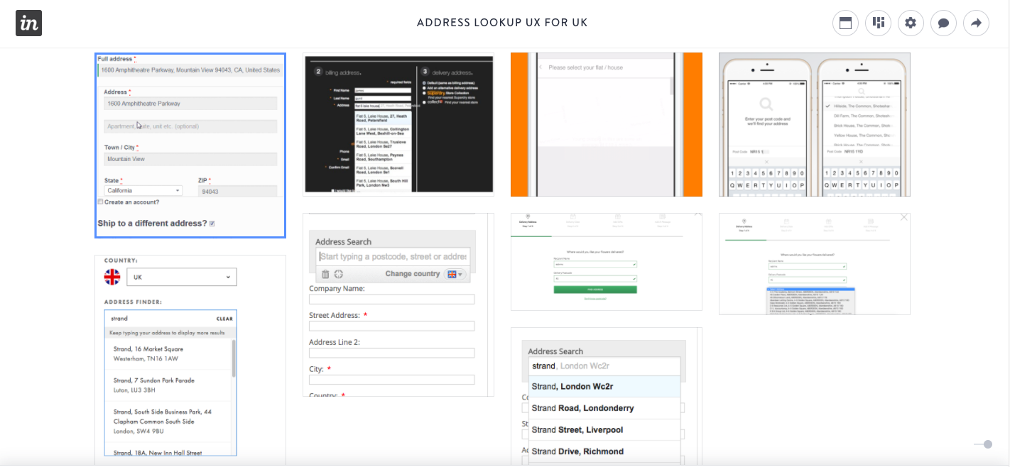
InVision board
After this, we made a research of all the A.P.I that are available to implement the address lookup in the fastest and easiest way possible. We wrote a one-page report highlighting the characteristics, price and pros and cons of each A.P.I and highlighting the best three solutions.
I wrote the use cases together with the logistics team in the UK and NL to determine the necessities of the design and functionalities. I listed them to the most used until the least used and specify its priority. Some of these use cases are:
Action: Subscribe to bloomon
Who is the user: New user
User goal: Complete the subscription in the less time possible and without address mistakes.
Standard flow: The user starts typing the house number and the street number and immediately he receives some suggestions with house numbers and street names that coincide with his typing but in different cities. The user selects one of these suggestions and the rest of the address details are completed.
Priority: Must to have
Alternate flow 1:The user starts typing the street name and house number and he receives suggestions with house numbers and street names that coincide with his typing but in different cities. He selected one of the suggestions but then he realised that it’s wrong. He deletes the result and starts typing again and selects the correct suggestion.
Priority:Must to have
Alternate flow 2:The user starts typing the street name and house number and he receives suggestions with street names and house numbers in different cities. He selected one of the suggestions but then he realised that it’s wrong. He edits manually the suggested result.
Priority:Must to have
Alternate flow 3: The user starts typing the street name and house number but the system is unable to make any suggestion (i.e is not a UK address/format) . In this case, the system don’t suggest anything and if the user tries to go to the next step he receives a message saying that his address can’t be found and suggest a standard UK address.
Priority: Must to have
Alternate flow 4: The user starts typing the house number and street name but he mistyped the street name. However, he receives some suggestions with street names that are similar to what he wrote.
Priority: Nice to have
Alternate flow 5: The user starts typing and he receives suggestions with street names and number houses that are near him based on his IP.
Priority: Nice to have
When we finished all this, I wrote the design briefing with all the requirements and deadlines. We started designing different concepts and solutions. We had one week to design different concepts and conduct some usability tests, and after this week we had a team meeting where we discussed the pros and cons of each solution.
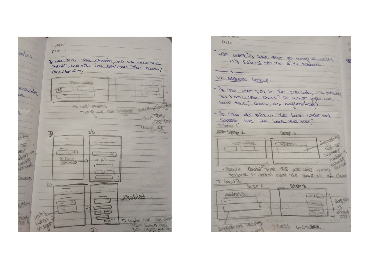
First sketches
Option 1:
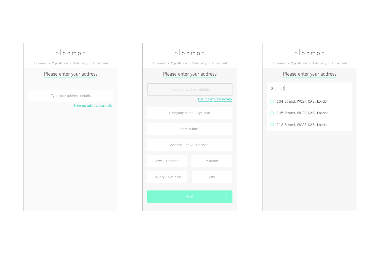
option 1
This option was a bit complicated for the user because they could start typing the address in any way and form. For example, they could start typing the postcode or the street name. This makes the development very complicated and time-consuming because they have to take into account every possible way of typing an address. And of course, it allows the user to make mistakes because, for example, they could write the street name with a typo and then the address lookup will show an error message and probably, they wouldn't know how to solve it.
Option 2:
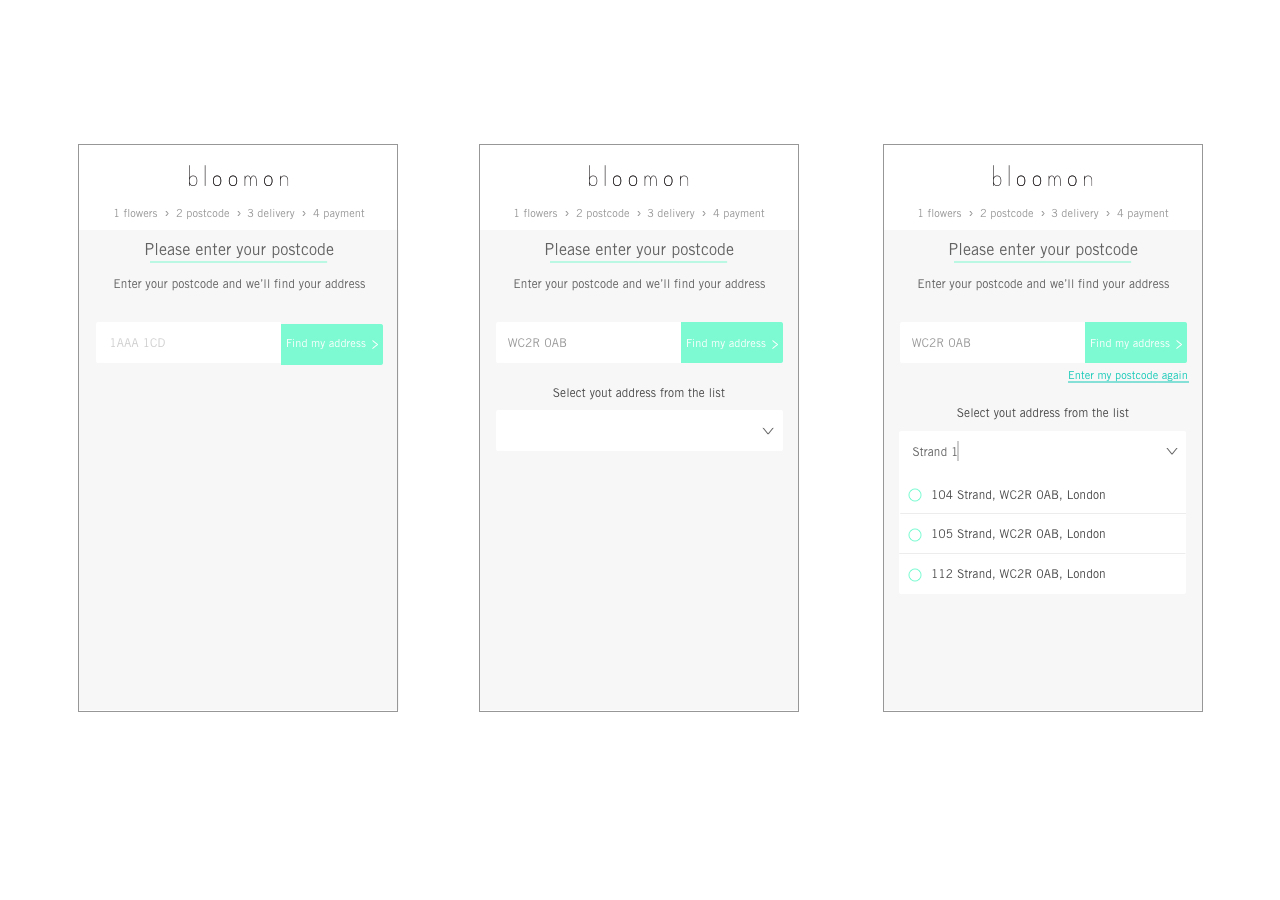
option 2
This option was better because the user only has to type the postcode which is a combination of numbers and letters. The only problem is that with this UI we still have the problem with the space. The user could forget to add the space or write it wrong.
The final solution:
Finally, we decided to implement the solution that starts with the postcode because it's the most characteristic of an UK address. By having the postcode we can know the street and area of the address.
To validate this solution we set an A/B test that will run during 3 weeks to evaluate the solution.
Solution for the UK:
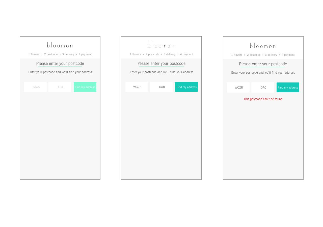
First step of the address lookup
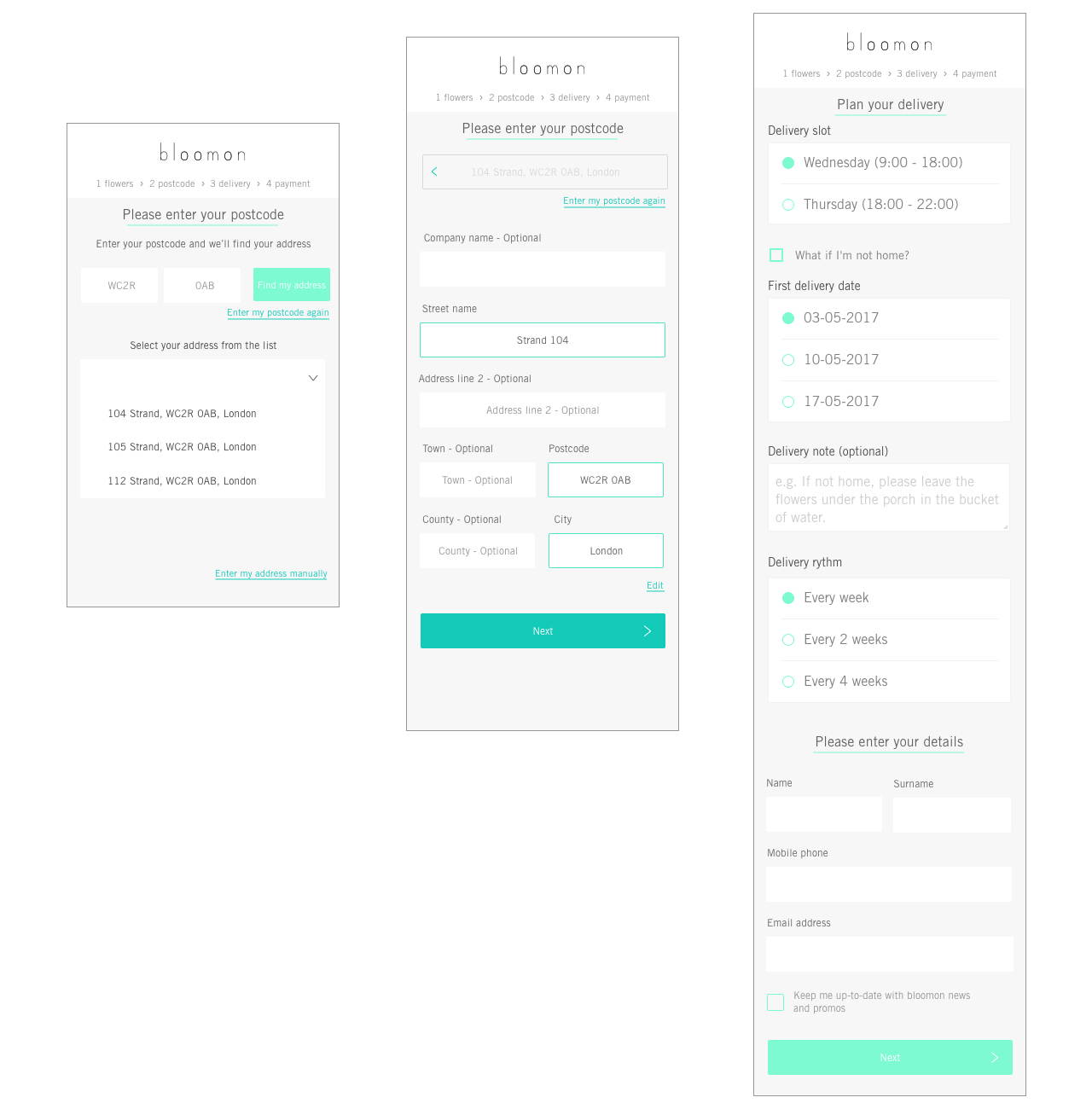
Second and third step of the address lookup.
Solution for the Netherlands:
The takeaways:
My personal takeaways from this project are the following:
Postcodes work very different in each country and it's a very complex problem to solve
The outcome is much better when there are different teams involved (Logistics, UX, Research...)
Users fill in an address form almost automatically without even reading the fields, which lead to mistakes if the UX/UI is not correct or does not follow the standards.
